Friday, November 11, 2022

A.B.C.s of 1 x 1 Cables

Bromefields Knitting Shop on Etsy

Knitted Cable Sourcebook

Infinite Cables

Cables - 

cars, telegrams, landline telephones, lifelines, internet, KNIT !

Who doesn't love cables? 

What follows here are my observations while learning to knit cables. Listed above are some excellent sources for those interested in furthering their cable knitting education. As always, nothing on my page is a 'paid advertisement.'

  1. The first listed is an inexpensive booklet on some traditional cable variations.
  2. Norah Gaughan presents a comprehensive study of cables.  
  3. Melissa Leapman presents her class on working cables as an icon, instead of a vertical row.
         Note: In the book, Norah presents a lovely edge stitch that she does not explain in the book. Being the lovely person she is, she gave me the 'recipe' along with permission to share it with you.


A cable, in its simplest form, is comprised of multiple strands. In the case of knitting, a cable requires more than one stitch. A Bavarian Twisted Stitch (also on Craftsy) is sometimes called a 'traveling stitch' and uses a 1 x 1 pattern. It's similar but is not quite the same, being knitted through the back loop.

Technically, a 1 x 1 cable stitch is not a 'traditional' cable stitch. As originated with Aran Sweater knitting in the British Isles, cables are made with a 2 x 2 (or more) sequence.

My hat pattern is from the Bulgarian knitter Elena Dimchevska, on Ravelry.


Used with permission from the designer


What made this hat so much fun for me, a challenged knitter is that it is cable-simplified, but not simple. I made mistakes, but part of my challenge was to keep on knitting by either making a way to continue on with the correct number of stitches, or drop back and repair one or two stitches - but not rip out an entire row or pattern repeat. That in itself is a learning experience. Again, the mantra is Swatch, Swatch, Swatch.

To the Good Stuff - 

The A.B.C.s of 1 x 1 cables

A. The forward stitch will usually be knitted - unless the designer says otherwise.

B. The behind stitch will usually be purled - unless the designer says otherwise.

C. Both stitches are knit when you want to create an X, or the behind stitch will become a forward stitch very soon, as in the next pattern row.

D. Stitches might be Knit/Purl when you want the forward stitch to lean to the right.

E. Stitches might be Purl/knit when you want the forward stitch to lean to the left.

F. Why aren't the stitches interchangeable? Because you are usually working right to left.
Unless you work left to right sometimes, and right to left other times.

Unless the designer tells you to do it differently - 


Wednesday, November 9, 2022

Crochet Cotton vs. Knitting Cotton Yarn

 What's the difference?

Consider the crochet "doilies" popular in Victorian decor. That trend lasted well into the 20th century and is still revered by some.

The crocheted doily was a knock-off of historic laces, that had been practiced for centuries but required skill and specialization. To this day, crochet is considered a 'lesser ' needle art in some quarters. Not this one.

Lacis, a favorite of Mary, Queen of Scots is, in my experience the most difficult of all the lace techniques. It requires the lacemaker to first knot a net as a base. Then to embellish the net, she or he enters the net with the needle at one point and weaves. If the lace has been executed correctly, the needle will emerge at the same place it entered the net when the weaving is finished. 'Net weaving' is a less complex version of Lacis and is often done on a commercially made net.

In crochet, the 'look' was accomplished by the technique "Filet Crochet," wherein the embellishment and the netting was created at the same time, row by row.

Knitting is a different discipline altogether. While lace can be knitted, not all knitting is lace. The same could be said of crochet, however, so what is the difference?

Crochet was popular for home decor, back in the day. It was washed often and must withstand chlorine bleach, or harsh sunlight. Knitting was most often done in wool, but we are discussing cotton here - so what about knitting? Both crochet and knitted items are popular today.  

Using crochet cotton for either knitting or crochet means using a more firmly spun thread, while cotton prepared for knitting is often softer. It is up to the user which they prefer.

Color Coding Your Chart

 I love color coding. I got my first BIG commission for introducing a color-coded filing system to Boeing in the 1960s. It was for the 737. Don't blame me, it was only the files.

To move on, I have had a lifetime of experience with color - and coding - and color coding. 

Today I am applying the principles to 'Knitted Cables.'

Fortunately, the color wheel has more than 3 primary colors: Red, Blue, or Yellow.

We get to use secondary, or even tertiary colors.

To make it even more fun - we will distinguish between warm and cool colors. And light and dark colors! What a festive array!

Secondary colors are what you get when you mix two primary colors: Purple, green, or orange.

By now you may have noticed that some colors are easier to see if they are darker. For example, 'orange' has been made 'brown' so it can be seen easily.  (I have not shown yellow at all, except - see below) !

But, if I put any color within a black outline, it is seen much more quickly. Even white  will show up if it has a boundary of black - as in:


(Black on black defeats the purpose of the illustration)

Notice that yellow and black have the most contrast. That is because yellow is a warm color, while black, like white, is neutral. Grey without an outline, almost disappears from the page. Also, scientifically, black is either all colors or no colors, (I forget which) and white is the opposite, but black is dark and shows up well.

Typographers will use those features of colors to give their message an impact. But everyone enjoys color - as witnessed by movies and tv producers.

Given that yellow, and its neighbors, red and orange, are warm colors and appear to come forward if I am illustrating a stitch that comes forward I will use a warm color.

Likewise, a stitch that lies behind a stitch that comes forward gets grey, outlined in black. Because it is behind - and harder to see.

That takes care of 'knit' and 'purl' - but what if your cable is ' knit - knit' or 'purl knit' ? Or 'knit - purl - knit'?

That is when we use tertiary colors and values. 

Tertiary colors happen when you mix two secondary colors, or a secondary color and a primary color.

They will show up as 'lavender-blue' or 'red-violet'.

The Value is seen as the lightness or darkness of a color. Such as 'red' vs. 'pink', or black vs. white.

So we have a whole array of colors, and values and temperature to record our data. And that doesn't even touch on texture. Y'all know what texture is - all touchy/feely.

Wednesday, November 2, 2022

When vision fails . . .

If we are lucky, we are blind from birth and can learn to see in other ways, from birth.

If we are lucky, we lose our vision gradually and can find ways to compensate.

If we are lucky, we lose our vision suddenly but have had a lifetime of seeing.

Either way, we are fortunate and will find a solution.

Here I will share mine, for knitting patterns . . .

I happen to love artificial intelligence. It helps me every day to find solutions to my problems.

For my waning vision, even after cataract surgery, I bought a good scanner.

  1.  Print my downloaded knitting pattern.
  2.  Scan it at 300 D.P.I. - dots per inch.
  3.  Open the 'picture' taken by the scanner in a photo manager with editing capabilities. I  use Microsoft Paint for simple tasks.
  4.  Resize the image to what you wish, making it smaller. For most knitting patterns, this gives me about 20 rows of knitting per portrait-layout page. In 'Paint' all I have to do is print in a portrait (or landscape) layout. I like approximately 3 rows to the inch.
  5. Now my pattern is large enough to color the squares, if desired, and can be seen easily from a distance when placed on my magnetic board.


Note:  Chart is for Milka Hat - found in Ravelry.Com
Used by Permission from the designer.

Thursday, October 20, 2022

More Knitting Progress

 I found a wonderful chart on Pinterest. When  I went to the source, I could see it was partial - which means to me that it has been ripped off someone.

Regardless, I loved it and will not share it. But it brought to mind, I needed to play around with cables again.

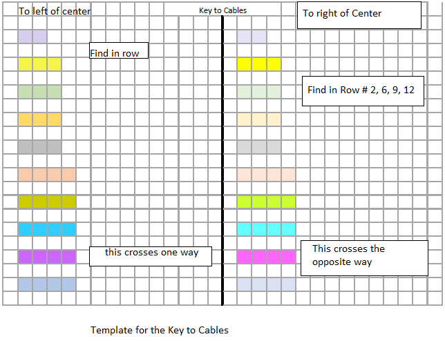
Since I re-chart everything to compensate for my 'traumatic brain injury' I had to come up with a way to chart the cables in a way that gives me a little extra help. Cables were not on my keyboard for knitting symbols, so I must do them by hand. 

This is the paper I came up with to make a 'key' - Please feel free to copy my template. It is PUBLIC, for free, as in, not selling anything.


This was made in "Paint" the free graphic generating device, and Excel from Microsoft.


Sunday, October 9, 2022

Conclusions of exercise: Bruno in a Beaker

 Next time - 

I won't 'activate' the Inktense color with a wetting agent until I consider the work 'done.'

    Layering color as you would with watercolors on paper may not work. Subsequent layers may not be permanent.

I will baste the fabric inside of the wooden frame, to allow it to lie flat.

I will "test" wash as many samples as necessary before working on the final piece.

    Maybe I will do two samples, and wash one vigorously, and one washed gentlyto test the permanence of the color. 

If I give these mug rugs as gifts, I don't want them spoiled with a first laundering.

How do I know to take that into consideration?

Think black silk boxer shorts.   

I may activate the Inktense with a liquid fabric medium, though it does add some stiffness to the fabric. I wonder: if I mixed it with water would it still work? Would it bleed?

Would gel outside the line of the painting help to control a hard line of color? 

With every answer, there are more questions.

Bruno in A Beaker

 What works . . . 


Orignal drawing and tracing to yellow tracing paper for transferring to the fabric. The cup in the original drawing was from a shiny cup in my collection. It would not show a good value study because it was too shiny and reflective. I chose another cup, as seen in the tracing.


Photo reference for the cup.


The sketch on the fabric using Inktense outliner. It washes away mostly. . . but not completely. Test it on your fabric before putting it down where you will want it gone.


First 'finish'  before washing out the gel.


After washing out the gel, perhaps not as gently as necessary. I wanted a good "test."


I didn't start from scratch, but really scrubbed, again, with a poly hot pad, or dishwashing scrubber (it came as a freebie with an order for the kitchen, not sure what it is.)


I re-did the coloring with the Inktense pencils, allowed it to sit overnight, and applied gel. It sat to dry overnight.

I applied white highlights in the eyes with acrylic fabric paint and added black toenails.

The cloth was removed from the frame when the paint was dry.

Following instructions on the acrylic paint box, I pressed it with my dry flat iron (no steam holes) on a polyester setting, for 3 minutes, moved the iron to cover the remainder of the image, and heat set for another 3 minutes. Instructions were to heat set for 3 to 5 minutes, so I felt safe. The number setting on my iron was a '2.' Instructions said to use 212° f, but I can't figure out how to measure the temperature of my iron.

After the fabric cooled, I put it in a tub with wool yarn shampoo - only because I felt it would be gentler than an alkaline detergent. Cotton would ordinarily call for synthrapol or hand-washing dish soap for washing. 

Why? Wool Wash for animal fiber, and an alkaline detergent for vegetable fibers. It's a science thing. 

It soaked with a few gentle swishes for at least 15 minutes, was rinsed, and hung outdoors under the canopy in the breeze. I put some clips on the lower edge to add a little weight. 

Before I added clips on the bottom, I noticed the breeze had folded it up on itself.


Even at a distance, you can see the color remains brilliant. I am satisfied with an acceptable first piece. It will be finished as a 'mug rug' for Bruno's Mom, who lives in the Philippines.